How does US fund and spend $3.8 trillion for healthcare? How does each player in the system stack up in funding or spending?

Warren Buffet memorably termed the healthcare industry the tapeworm of the US economy, referring to the apparent crowding out of investment in other industries as healthcare costs exceed 17% of US GDP — $3.8T in 2019.
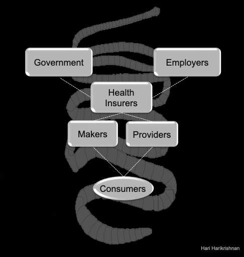
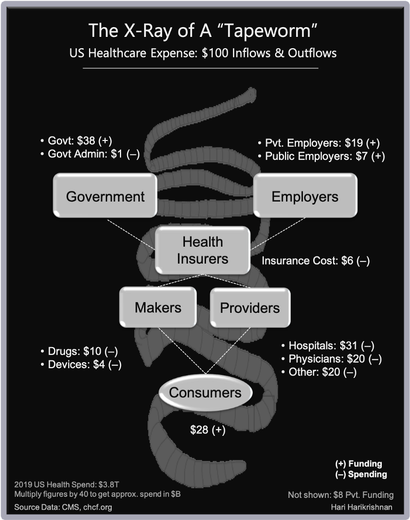
See below on how $100 flows in and out of the “tapeworm”.
The inflow (shown with ‘+’ sign) is the funding originating from various participants in the system.
Inflow = Consumer contributions and direct spending + Govt spending + Employer contributions;
Outflow = Provider spending + Drugs/Device Makers revenues + Insurance Costs + Govt Admin cost;

Every large bucket of funding and spending is shown as % of total expenditure, so that we can see the elephant (or rather the “tapeworm”), at a glance. When one player says the problem is with another, we know the size of the pie each player represents, if not their influence in the industry.
Are our passionate debates on US healthcare spending — the highest in OECD countries in absolute terms and per-capita — calibrated to the size of each participant’s funding or spending?
For example:
- Pharmaceuticals is 10% of the pie, but hearing the debates on big pharma would make one think that we can solve our cost problem by reining in Pharma.
- We hear about the middlemen problem. The middlemen — insurers and PBMs (pharmacy benefit managers, these days part of insurers) is a 6% problem.
- Private sector employers fund 19% of spend, but the portion of consumer spend tethered to private plans adds clout to them since 50% of the population is enrolled in employer plans.
- Consumers fund 28% ($1T) in taxes, premiums, and out-of-pocket expenses. The high portion of spend doesn’t seem to translate to influence
- Provider spending is 70%. Before we get excited about that tranche, reflect that this is a highly labor-intensive industry. We know wages aren’t sky-rocketing here or in the economy as a whole. Do we think more utilization reviews and prior authorizations by insurers and more optimization on how we price each service (via relative value units or RVUs) will help?
Where are the possible hundreds of billions in cost-savings hidden? Yes, we have room to tighten this all around in the many layers below these buckets. Still, how can large swathes of costs be drained from this system?
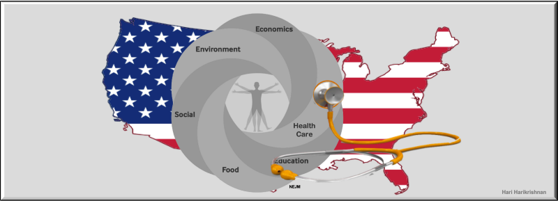
Does the answer lies outside this frame, in non-clinical approaches to health and wellbeing? Is this “X-Ray” a mere reflection of how much it costs to care for our population? Are we too focused on cost of disease and not on the whole persons in our populations?
The old quote from Dr.William Osler springs to mind:
It is much more important to know what sort of a patient has a disease than what sort of a disease a patient has.


