In the age of automation and artificial intelligence, in the age of user experience, a visual design to speed up the delivery of health care to those in need stands out.
I was researching cancer. I came across a cancer pathway graphic design by Will Stahl-Timmins. Will had designed a poster to expedite the intervention and referrals for potential cancer patients for BMJ (formerly the British Medical Journal) and NICE (National Institute for Health and Care Excellence) in the UK.
It is a fascinating poster to help the GP’s (General Practitioners in the UK, the equivalent of PCPs, Primary Care Physicians in the US) quickly choose the next best action to treat cancer when confronted by a myriad of symptoms.
The poster looks like this (reproduced from BMJ/NICE):
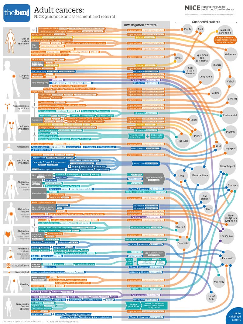
Detailed view available here.
As I read through Will’s blog on how he designed it and the behind-the-scenes story, I marveled at the entire process of its design, not just its utility.
Three takeaways stood out from the final output and the process to get to this cancer pathway visual design:
- Function: The poster enables quick intervention for the next-best-action for the patient.
- Form: The poster by its sections and their juxtaposition distills a complex set of variables down to a navigable chart for a physician — the first line of defense for the patient and the healthcare system.
- Collaboration: How does a poster like this come to life if not for the droves of subject matter experts behind it?
1. Function
Let’s say you walked into a clinic due to a hoarse voice. God forbid. You are not expecting to walk out of there with a cancer diagnosis. But the doctor was concerned. Wouldn’t you rather if the doctor did the best possible diagnosis as to the cause of the hoarseness?
Wouldn’t you rather the doctor had the best tools to determine the best next step in your diagnosis or cure, taking apart the 20+ different symptoms that might be a cancer-related cause affecting a particular organ in your body?
That is the function this graphic serves for 2200+ GP’s in the UK and the patients they serve: Quickly triaging a patient for the right next step in diagnosis or treatment is crucial to deliver appropriate care and ensure that the health system is optimally utilized.
The graphic lets the physician arrive at a quick “next-best-action” and speeds the patient along a crowded highway to the specialists.
2. Form
There are 3 parts to the design — symptoms, intervention, cancer type or affected organ — as shown in this excerpt below.
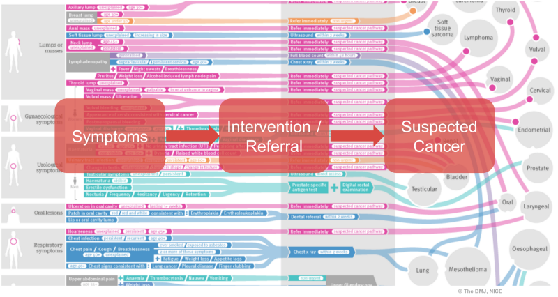
These are cleverly (and after many many iterations) juxtaposed and interconnected to make a meaningful pathway from symptom to diagnosis and next step in care.
For example, an unexplained, persistent hoarseness in a person over 45 years old gets an immediate referral (shown by connectors in colour and text) for a potential diagnosis for laryngeal cancer; an unexplained breast lump for an over-30 patient gets an urgent referral for breast cancer.
When we consider the multitude of symptoms — ranging from visual indications to experienced symptoms to the organs involved — it is easy to see how a picture like this can become a spaghetti of criss-crossed lines that is unusable. But not this!
A visual design this elegant and simple does not happen by accident, nor overnight. It takes reviews and iterations. The hackneyed phrase “let’s keep it simple” is often uttered without regard for what it takes to simplify!
The entire iterative process of designing adult cancer pathways for NICE is described hereby Will Stahl-Timmins in his blog, “An Impossible Cancer Spaghetti”. It is a must-read for anyone who aspires to simplify concepts or create simple, elegant, and usable visual designs.
3. Collaboration
In the 21st century, health care needs a redesign for many reasons –from aging and longevity to availability of digital technologies to improve care delivery.
To leverage the medical and information technology innovations to solve the surge in demand for health care, collaboration is essential — collaboration between the clinical experts and the digital technology experts; collaboration across doctors, engineers, scientists, creative designers…
Collaboration at this scale requires expertise and empathy. It requires a humane intelligence that keeps the patients and practitioners at the center of the care pathway redesign.
The BMJ poster is a prime example of that humane intelligence.
The poster and its creation process brings to the fore all the great things that can be accomplished by collaboration to bridge the gap between cure and care — between knowing what to do to care for human conditions and delivering it at the point of care.
Epilogue
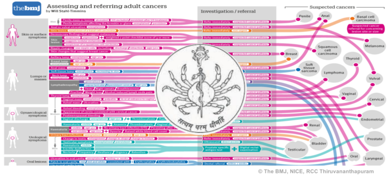
During my travels earlier this year, I came across the logo below. It is the logo of the Regional Cancer Center in Kerala, India.
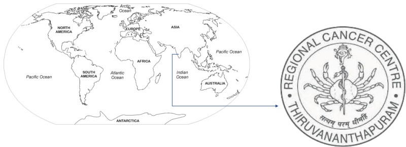
At its center, the logo depicts the Rod of Asclepius (rod with snake on it) overcoming Cancer (“crab” in Latin). Since then I have seen visual designs where the crab is conquered by more violent and explicit means. But this particular logo struck me as profound because of its subtlety.
It suggests the ascendancy of the snake over the crab, but not by a stab or a strike, but just by the rod being in the foreground.
It is as if the snake is coaxing the crab into submission. It is a study in visual design for poignance and meaning.
Thousands of years have passed since Asclepius; more since cancer was first documented by the Egyptians. The BMJ/NICE artifact is a refreshingly practical, day-to-day mechanism to make the intent of this logo a reality. It speaks volumes about how we collaborate to enrich our knowledge and apply it to the job of caring. And that is our very humane intelligence!


